The experience of falling forward and pulling you in are what it’s about

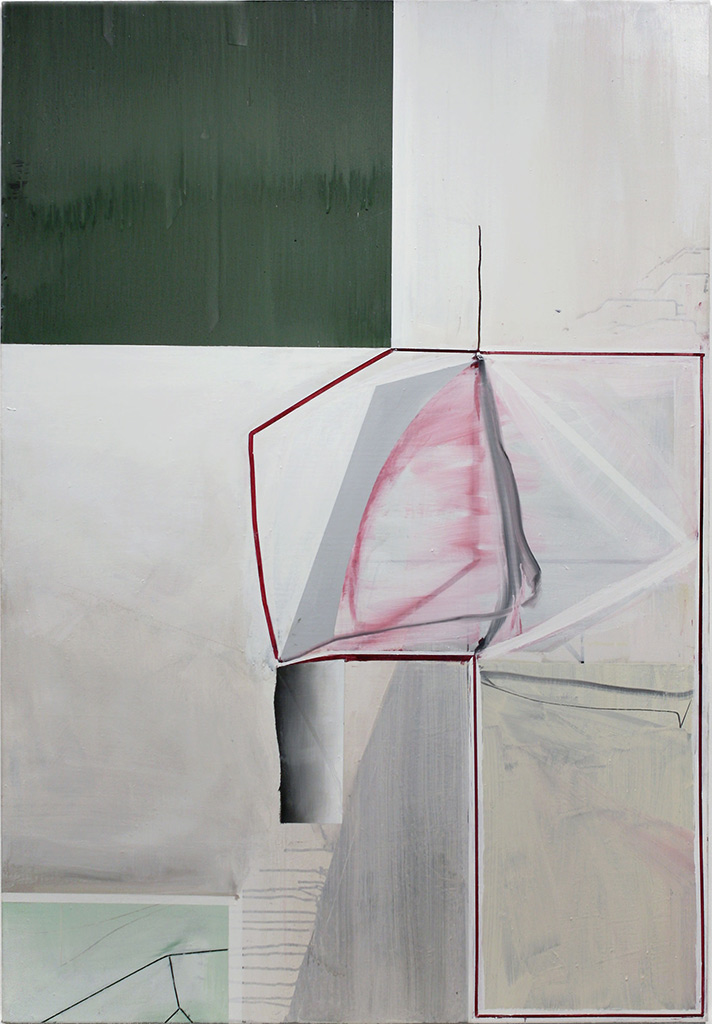
78 x 54 1/4 in. © Gordon Moore. Courtesy of the artist
The suggestion of an element of dimension or illusion in painting has been interesting to me for some time simply because it was considered as totally verboten for so long in the eyes of many. After Matisse we very quickly reached a point where flatness became the litmus test for purity in painting. In my view, the principal elements of Matisse — flatness, saturated color and patterning — come directly out of Gauguin and his ecstatic experiences in Tahiti. But Picasso did not choose to fondle that “hot patato.” I’ve heard it expressed by some artists that as a consequence Picasso (through cubism) ends up being more a sculptor than a painter and Matisse (through flatness) more a painter than a sculptor simply because one (Picasso) chose to deal with dimension more than the other, even though both worked in the two mediums. I’ve always felt very uncomfortable with that categorical a distinction as a value judgment. Both are equally potent directions for painting, depending on how one handles them.
Image courtesy of Museum of Fine Arts Boston. Licensed under Public Domain via Commons
© 2015 Succession H. Matisse / Artists Rights Society (ARS), New York
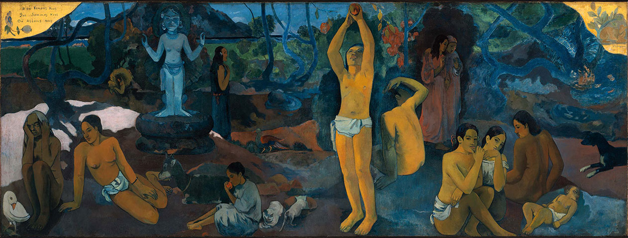
Oil on canvas, 54 3/4 x 147 1/2 in.
Image courtesy of Museum of Fine Arts Boston.
Licensed under Public Domain via Commons.
Fair Use Disclaimer
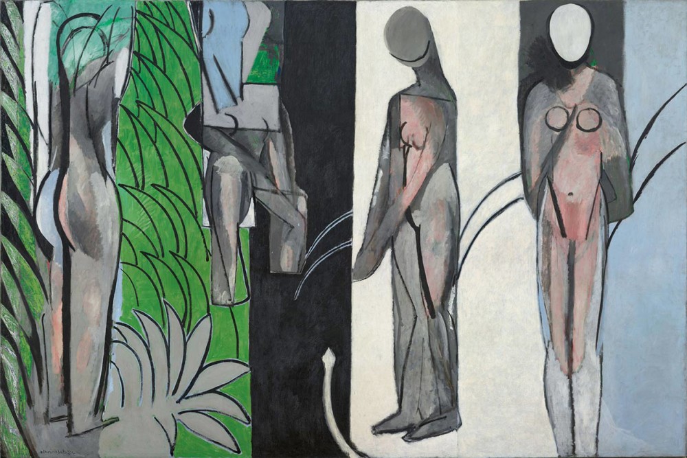
Oil on canvas, 102 1/2 x 154 3/16 in.
Art Institute of Chicago, Worcester Collection
© 2015 Succession H. Matisse / Artists Rights Society (ARS), New York
Fair Use Disclaimer
+
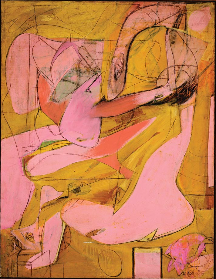
My own personal, most dominate, influence as an American painter from the beginning has always been de Kooning and to this day I don’t think I have ever gotten over “Pink Angels” simply for the way in which de Kooning uses line as an articulating, overlapping depth element and for the way he plunges that extraordinary “hammer head shark”- like shape into the middle of that extraordinary painting. It seems literally “thrust” into the center and the “tail” on it has just the slightest articulation of modeled dimension, which gives it such physical presence. That communicates. Anyone walking through the de Kooning retrospective at MoMA would have to acknowledge de Kooning’s debt to Picasso. The two most important paintings for me becoming a painter were Les Demoiselles d’Avignon and Pink Angels. The Picasso because of that cubist “faceted” unfinished-like touch which alludes to dimension and the de Kooning because of his overlapping line and that “shaft” on the “tail” of that shape. Both give dimension to each work. But by the time we get to what was being referred to as “Greenbergian Formalism” in the late 60’s and early 70’s, when I first showed up in New York out of Graduate School in New Haven (1972), Greenberg’s influence was so pervasive that painting in the eyes of many critics had been reduced to, as Leo Steinberg succinctly put it: “stripping painting down to its irreducible essence, i.e. the coincidence of flattened color with its material support.”
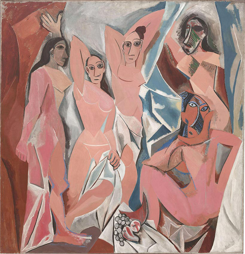
© 2015 Estate of Pablo Picasso / Artists Rights Society (ARS), New York
Museum of Modern Art via Wikimedia Commons.
+
This very perceptive observation occurred in Leo Steinberg’s brilliant essay printed in Artforum in 1972 (the year I came to New York) entitled “Reflections on the State of Criticism” which was nothing less than a highly perceptive assault on Greenberg’s complete dismissal of Rauschenberg and Greenberg’s cultural hegemony in the art world at the time, in which Steinberg referred to the mind-set cultivated by Greenberg’s polemics as: “Preventive Aesthetics.” Though I read it several years after it first appeared, it hit a very responsive chord with me in part because I had never felt comfortable with “taped graphics” which so much of the painting being done then looked like to me. I remember saying to several artists then that “every time I looked at a late 60’s early 70’s painting all I could see was 50,000 miles of masking tape.” 3M stock must have gone through the roof at the time just from their profits in the Art World!
So it was in part my negative reaction to taped, hard-edge painting, as well as my positive response to the potential alluded to in both Picasso’s and de Kooning’s suggested gestural dimension and use of line, that never stopped being a potential source for me. I want just enough of a “fragment” of dimension in the work as an allusion to real space as a way of reminding the viewer that it is just a painting, but a painting that was arrived at through an emotive, spontaneous experience with life in and outside of the painting of it. That slight sense of dimensional space will (hopefully) pull one into the picture, as if falling forward to a point to where you’re not sure where you will end up and you do not overly care. The experience of falling forward and pulling you in is what it’s about.
Having said that, this is rather tricky stuff to pull off because it’s very easy to fail through over-illusion, which is tantamount to pictorial death. All in all, I’m ok with that, because in my book “where there is no risk there is no art.” I’m not the least bit interested in making just safe product as art. Each work is in a sense an “aesthetic journey” and an important part of that journey is the possibility of failure. Informed intuition is the guiding principal of abstraction for me. I always have an idea when I begin work, but only a vague idea; and in any event that idea must never obfuscate discovery made along the way.

78 x 54 1/2 in. © Gordon Moore. Courtesy of the artist
+
My use of line in painting also refers back to the urge to fuse drawing and painting into one act. It all goes back to drawing. I remember very clearly, many years ago, when everyone was proclaiming the death of painting, that Artforum actually did a cover issue positing the question, “Is painting dead?” That issue canvassed a number of artists for their reaction to that question and I remember in reading it that one of the first things that occurred to me was: No one would have, even to this day, conceived of the question: “Is drawing dead?” That would never ever occur to someone. So the question then became: What is it that happens when we go from drawing to painting that so many people seem anxious to kill? And the best that I could come up with was that drawing was so intuitive, spontaneous and direct that it made painting, in the eyes of many, seem pretentiously after-the-fact and contrived.
Now it was very clear at the time that the limitations imposed on painting by the strictures of academic thinking, which so many of us had dealt with coming out of the post-WWII University Art School Institutions, had created a context in which one had to aestheticize virtually every act within a work in order for it to achieve competence. And part of that, part of the urge to “purify” the work, was the elimination of anything that could be interpreted as gratuitous. The origins of what came to be called “minimalism,” in my view, are just that prosaic. But there is at the same time a wonderful pictorial economy in that, which is very appealing and which had a huge impact on me.

40 x 27 in. © Gordon Moore. Courtesy of the artist
Confronting “minimalism” was pretty much the first 10 years of my life as a painter in Manhattan and I can remember many times sitting in my studio on Prince Street in the late 70’s feeling an uneasy self-consciousness at having to build on an “inheritance” that left little room for you to move in as a painter. But there is at the same time a wonderful pictorial economy in that, which is very appealing and which had a huge impact on me. As Robert Hughes had said at the time: “There is more to painting than a black painting by Reinhardt and a white painting by Ryman,” and I had found much to agree and identify with in that observation. So eventually, if you are going to continue painting, you have to find a way of pushing through that. What I turned to was my interest in layering structures one over the other as a way of achieving an internal depth in the picture that allowed me much more freedom of movement and much less self-consciousness, which was very liberating. I noticed that, in the black and white photographs I was just then beginning to pull up in the dark room, the slightest linear element in the picture often cast a shadow which very often was entirely detached from the element that had cast it; and that if I drew on top of it, I almost automatically had a certain level of depth that I could then build on — or eliminate — depending on whether or not it “worked” within the structural configuration of the piece.
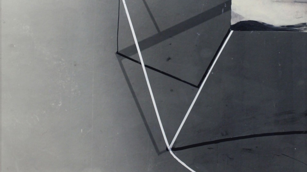
© Gordon Moore. Courtesy of the artist
That was always the determining aspect: whether or not it simply worked. So the “background” marks were there already. All I had to do was respond to them. The paintings which started coming out of this mode of drawing at first had a kind-of equivalent which I had found in ink. The ink bled and I started using the bleeding as a kind-of “photographic” ground which had unlimited potential. I have just begun to scrape the surface of what I can do with that use of material. That’s essentially how the foreground/background depth (somewhat in reverse) evolved.
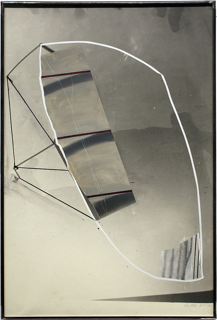
© Gordon Moore. Courtesy of the artist
Somewhere along the way, about 20 years back, I built a darkroom in a studio I had in a big building with other artists in Jersey City, which has since been torn down. I often had a darkroom all the way back to undergraduate school in Seattle and I had always taken 35mm black and white photos with an old Nikon I had, having been very influenced by the post-war 35mm photographs of Robert Frank and Lee Friedlander. And I always loved watching images come up in the tray as they were being processed.
Growing up in Kansas, one of the best things my parents ever gave me were these trips we would take every summer to one of the coasts or up to Canada and back. They were amazing in the 50’s, and I saw the whole United States fly by the back seat window of first a ‘54 Chevy and then a ’57 Buick. The stuff I saw. So when I came across Frank’s The Americans, which he shot in 1956, I almost fell over. I was just totally blown away because I had absolutely lived those photographs and there’s one in that extraordinary book which he took of a Hotel window in Butte, Montana that I actually DID live. And I told him that years later. So anyway, I had built this darkroom back then, originally to process photographs I had decided to take of the World Trade Center, somewhat in abstraction, on clear days. Every time I went over to my studio in J.C. I kept walking by the World Trade Center and it seemed to me that no one had ever photographed it the way I was seeing it. So I decided to do this bookwork of these photographs and I had to stop painting for a while to do this. I wanted to shoot it in 6 x 6 with Tech-Pan, a film they don’t even make anymore, so it would be in high resolution. So I went out to Hempstead, Long Island and bought this reconditioned Rollei-Flex from a dealer out there named Jimmy Koh, who was the real thing. He had worked for Franke & Heidecke in Germany. It’s just this great camera. And I started doing this bookwork on this WTC book, which I built out of aluminum, and the next thing I know is like a year goes by and all the while I’m doing this I keep noticing that there is something very painterly about the way developer flows over photo-emulsion paper, sometimes dripping and running and especially when the developer is almost exhausted and dirty, weird shit can happen. And so I start playing around and noticed that if you take the print out to sunlight just after stop, weird tonal color starts coming up in black and white paper, the tone and color of which varies depending on the make and brand of the paper.
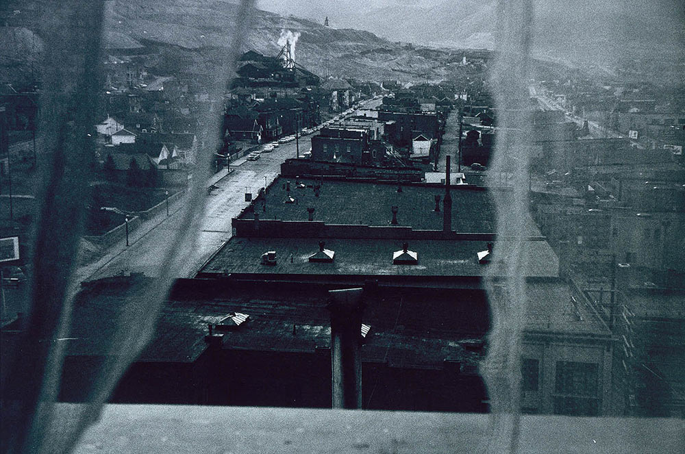
© Robert Frank. Courtesy the artist and the Smithsonian American Art Museum Museum. Fair Use Disclaimer
After a while it became very obvious that not only was there a great deal of potential there for drawing, there was a great deal of potential there for painting. And that’s really the simple way in which the work I have been doing in drawing and painting for the last 8 years was generated. It may be only a nominal difference, but it’s not so much photography as darkroom-process, which was the source because very often there’s very little photographed and many times nothing is actually photographed. And I’m talking here only about drawing on top of the print out of the darkroom for drawings only. I never collage photo-prints onto paintings. The idea of such a thing is apocryphal to me! Painting is paint. At one point I had taken a 35mm picture of a metal strap I saw on a subway wall. I still don’t know what it actually was. It was just there and I liked the configuration. I pulled it up on 8 x 10 paper and used it as a ground to draw on top of and immediately there was this depth, which I was of course interested in, and that’s how the drawings really started. And people responded. After that I realized that I could just put tape in any configuration I wanted on a wall and use that as the ground. I use the Rollei-Flex because I can pull it up to roll size paper, and if you play around and dodge under the enlarger you can completely disconnect the linear element of the tape from its attachment to the wall. And that’s very interesting to me as a starting point for a drawing. You simply cannot tell really what you’re looking at and I’ve often had to point it out to people because they can’t tell what is in the photo-paper from what is on the photo-paper. There are problems of course, but you work them out. Humidity acts on photo-paper very differently than on ordinary paper. And the surface can be very difficult to control ink on top of. But there are ways to do what you want and there are virtues also. Photo-paper is very tough. It can take tape easily and is remarkably archival if you fix and wash it properly. That’s the only thing I do properly. Other than that I try to violate every known darkroom procedure there is because I end up drawing on it. That’s the whole idea. At this point I don’t think I’ll work on anything but photo-paper for drawings.
+
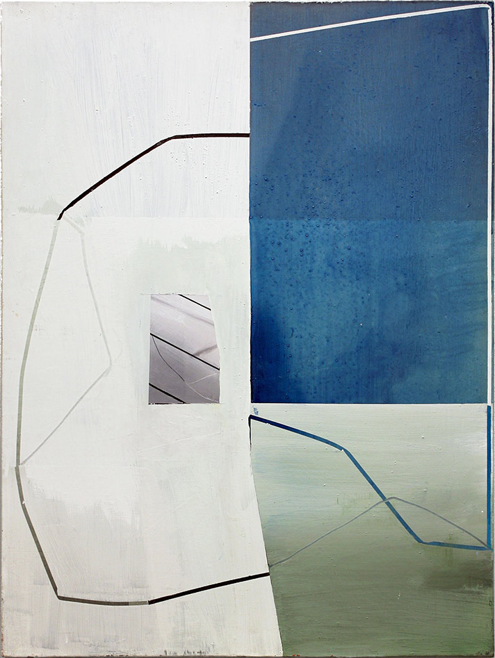
40 x 30 in. © Gordon Moore. Courtesy of the artist
One of the problems I had run into over the years with painting was that I had grown very dissatisfied and somewhat frustrated with the “dryness” of canvas and so I started working on ways to get around that. At first I had built-up layers of paint to a thickness that enabled me to cut through it with a dull matt knife and literally pull the paint off the canvas as if skinning the hide off a mule. I did this for many years and I liked the process because it was a different way to make a painting and it yielded a straight edge that was cut, not taped. But it was laborious, very physical, and labor intensive and eventually the work it yielded seemed too formally familiar and “process heavy.” Richard Serra said a very good thing in an interview years back with Lizzie Borden about drawing, that though formal language in art is very important, if the formal language ends up being the dominate content in the art, it becomes too susceptible to obvious formal analysis, too bereft of enigma. Process is very important, but process alone can often end up being too much of a “period piece novelty.” And I wanted to avoid that which was easy for me to do because I‘m not a process artist. I had started building up layers of paint using just a mixture of latex, gesso and what was then called Rhoplex (it’s now called Acrylex). But the mixture very often yielded a surface that was too glossy, which I did not like. So I started adding pumice into the mix, originally as a dulling agent. And the more I did that, the more I realized that enough layers of that mix created what I came to call a “paint slab” that completely covered the surface of the canvas and eliminated the dryness problem. It was very tough (an important aspect for me) and could be made to approximate the smooth, but just slightly gritty surface of a hot press piece of paper, and that was what I wanted. I stopped cutting paint and started pouring paint over the “slab” and found that by varying the amount of pumice I could approximate the separation of particles of dirty developer over photo-emulsion paper by the separation of poured paint particles over the grit of pumice on “the slab.” It takes about 4-5 days with the painting on the floor to build up “the slab” but that’s what I paint on now and that’s why I use pumice.
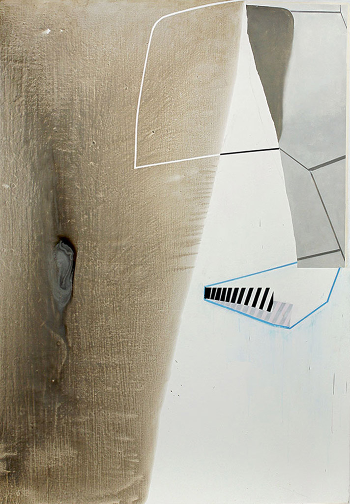
© Gordon Moore. Courtesy of the artist
+
In a sense, enigma is the dominate interest for me in art. The more art I see—and I think in 41 years in the art environment in New York I have seen quite a bit of art—enigma is that aspect of an artist’s work that holds me the longest and the thing that separates one artist from the rest. But enigma does not necessarily make you very appealing to curators or museum people who tend to think in terms of groups and movements in art. Making decisions in ones work to satisfy current, very often extremely temporal concerns, has never been an option for me. And since the art “context” now is so enormous and the field so crowded it seems to me that the only way to “locate” yourself as an artist is to pursue those discoveries within your own world that distinguish your work from the sea of art around you. If you do that, other artists, other minds will find you.
Gordon Moore’s work can be seen in the collections of the Museum of Fine Arts, Boston, MA; Yale University Art Gallery, New Haven, CT; Baltimore Museum of Art, Baltimore, MD; General Electric Corporation, East Cleveland, OH and the Krannert Art Museum and Kinkead Pavilion, Champaign, IL. He has received numerous awards and grants including the National Endowment for the Arts-Visual Artists Fellowship, the Louis Comfort Tiffany Foundation Award in Painting, the Adolph and Ester Gottlieb Foundation Award in Painting, the Academy Award in Art from the American Academy of Arts and Letters, the Pollock Krasner Foundation Grant, and most recently a New York Fine Arts Fellowship. Gordon Moore is a graduate of Yale University (MFA, 1972) and the University of Washington, Seattle (BA, 1970). He lives and works in New York.
It’s estimated 1 in 10 men has a problem related to sexual intercourse, such as erectile disfunction. Finally there isn’t anything you can’t get on the Internet anymore. In our generation divers articles were published about tadalafil vs sildenafil. What may patients ask a soundness care professional before taking Viagra? Few medications are used to treat impotence. How you can find more information about read more? The most great thing you need look for is sildenafil vs tadalafil. In point of fact, a medical reviews found that up to three quarters of people on these meds practice side effects. One way to treat erectile disfunction is to make several idle lifestyle changes, another is preparation. Counseling may be valuable.
Tags: de Kooning (Willem), Dimensionality/Space, Empiricism, Epistemology, Frank (Robert), Gauguin, Knowing, Matisse, Minimalism, Painting, Photography, Picasso, Process, Space
